Live Site Address: http://www.thedreamreaper.net
The Dream Reaper is a new webcomic being published online by Artist and Illustrator Augustinas Naslenas, working from his studio in Sheffield. This is a brief exploration of the code I used to make the site and some background. I will transform it into a tutorial in the coming week, but for now it is annotated code with some information / rough description.
Design Proposal
Gus approached me about a month or so ago to see if I could assist him with his vision with Dream Reaper, we had met randomly at a show he was doing at a Sheffield gallery and had a chat about Terrence Mckenna, technology and plants, so I knew that this guy was a fellow I had a lot in common with haha, his art piece also wowed me with it’s mix of the futuristic, the sacred and the ancient / occult symbolism and I recognised him as an artist engaged in work that was of much interest.
He proposed creating a multi-platform, responsive template for a webcomic he had in the pipeline, based around ideas of Shamanism, journeying and dreamwork. This naturally to me sounded like an amazing idea and challenge, so I jumped at the chance to approach it with my knowledge and experience of designing for the web.
The initial brief was clear, but it was going to be challenging in some respects, these respects being the way each strips had to nicely scroll on all devices (Tablet / Mobile / Desktop etc) and how to present that best was a key element, and had to be central to the sites design. The website also provided some interesting presentation / UX / UI questions – how to present the strip, but also how best to display chapters and navigation etc.
What follows is an exploration into the main technical implementations on the site thus far and some context and explanation of what the code is doing. It’s the first time I’ve done a more technical / in-depth blog like this, so please give me feedback if you have any. I am still looking to develop this website still further, so please bear in mind that whilst the website is up and running, there are still some incremental improvements to be made, so this does not reflect the final version of the code, which I am looking to next convert into a WordPress theme. Now with that preamble out the way….
Dependencies
- Bootstrap 3 for responsive layouts etc
- Fontawesome – For Icons etc
- Google font CDN’s
- JQuery
<link href="css/bootstrap.min.css" rel="stylesheet">
<link href="css/bootstrap.css" rel="stylesheet">
<link href="css/custom.css" rel="stylesheet">
<link href="https://fonts.googleapis.com/css?family=Courgette" rel="stylesheet">
<link href="https://fonts.googleapis.com/css?family=Passion+One" rel="stylesheet">
<link href="https://fonts.googleapis.com/css?family=Kaushan+Script" rel="stylesheet">
<link href="https://fonts.googleapis.com/css?family=Condiment" rel="stylesheet">
<link href="https://fonts.googleapis.com/css?family=Gloria+Hallelujah" rel="stylesheet">
<link rel="stylesheet" href="css/font-awesome/css/font-awesome.min.css">
Layout and Design of Dream Reaper
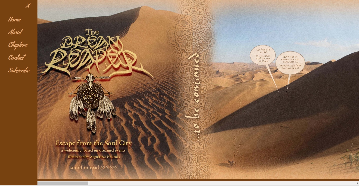
The first challenge and the major one to tackle straight away was the representation of the strips themselves as part of the main interface, Gus wanted ideally a responsive horizontal strip that would scale appropriately, maintaining maximum readability across all devices. I decided to use Bootstrap to create a basic layout (Using bootstrap pre-defined layout classes such as container / row fluid etc ) with container and a sidemenu.
The code for the HTML5 layout and associated presentation CSS (defined in Custom CSS) for responsiveness is displayed blow with annotations.
Layout HTML for comic Image/s
<div class="row-fluid">

    <button type="button" onclick="openNav()" id="backward" class="btn btn-default back"><i class="fa fa-bars fa-3x" aria-hidden="true"></i></button>
        <div class='strip scrollmenu'>
            <img src ="content/eftsc-cover.jpg" class='make-it-fit'/><img src ="content/eftsc-4.jpg" class='make-it-fit'/><img src ="content/eftsc-cs.jpg" class='make-it-fit'/>
        </div>
    </div>
<!-- /row -->
Notes: Images have to be inserted into div as they are presented or else it creates a gap between images, breaking the design somewhat, seems to be a whitespace issue. The row fluid is a standard Bootstrap class that defines a row within the container div above it. The custom classes are “strip” and “scrollmenu” which in turn define that div as scrollable and defines some responsive and presentational css to ensure readability and scalability of the div / images within across all devices.
Each image also has it’s own class “make-it-fit”. .
The Button is for the menu to open up with an on click to trigger the openNav() javascript function which opens up the sidemenu.
Get onto that more below later…
Read CSS below for further context
CSS for presentation of Comic Image/s
/*Classes to add scrollmeny to div rowfluid */
div.scrollmenu {
    overflow: auto;
    white-space: nowrap;
}

div.scrollmenu a {
    display: inline-block;
    top:0;
    color: white;
    text-align: center;
    padding: 14px;
    text-decoration: none;
}

div.scrollmenu a:hover {
    background-color: #e4bd78;
}

/*class for main content container div rowfluid for strip*/
.strip {
     /*Resize div to current viewport*/
    width:100%;
    height: auto;
    /*Positions content in center, add no repeat and fixed positioning*/
    background-position: center;
    background-repeat: no-repeat;
    background-size: cover;
    position: fixed;
     /*Maintains position*/
    left:0;
    right: 0;
    top: 0;
    bottom:0;

    text-align: center;
}

/*Image class to make image/s responsive within container rowfluid */
img.make-it-fit {
    position: relative;
    max-height: 99%;
    width: auto;
}
Next up is the layout and presentation / CSS and javascript controlling the side menu
Side Menu Layout HTML
<div id="mySidenav" class="sidenav">
<a href="javascript:void(0)" class="closebtn" onclick="closeNav()">×</a>
<a href="index.html">Home</a>
<a href="about.html">About</a>
<a href="#" data-toggle="collapse" data-target="#collapseChapter" aria-expanded="false" aria-controls="collapseChapter">Chapters</a>
<div class="collapse chapternav" id="collapseChapter">
<a class = "chapter-inactive" href = '#'>1</a>
<a class = "chapter-inactive" href = '#'>2</a>
<a class = "chapter-inactive" href = '#'>3</a>
<a class = "chapter" href = 'index.html'>4 - The Meeting</a>
<a class = "chapter-inactive" href = '#'>5</a>
<a class = "chapter-inactive" href = '#'>6</a>
<a class = "chapter-inactive" href = '#'>7</a>
</div>
<a href="contact.html">Contact</a>
<a href="subscribe.html">Subscribe</a>
</div>
Notes: See below for CSS context for classes. The div with class collapse chatpernav is the submenu for the chapter list that is opened via the datatoggle controls in bootstrap which you can read more about on the Bootstrap knowledge base
CSS Sidemenu
/* The side navigation menu */
.sidenav {
    height: 100%; /* 100% Full-height */
    width: 0; /* 0 width - change this with JavaScript */
    position: fixed; /* Stay in place */
    z-index: 2; /* Stay on top */
    top: 0;
    left: 0;
    background-color: #77420f;
    overflow-x: hidden; /* Disable horizontal scroll */
    padding-top: 60px; /* Place content 60px from the top */
    transition: 0.5s; /* 0.5 second transition effect to slide in the sidenav */
}

/* The navigation menu links */
.sidenav a {
    padding: 8px 8px 8px 32px;
    text-decoration: none;
    font-size: 25px;
    font-family: 'Condiment', cursive;
    color:#ecb685;
    display: block;
    transition: 0.3s;

}

.sidenav h2{
    padding: 8px 8px 8px 32px;
}

.sidenav a.chapter{
    font-size: 20px;
}

.sidenav a.chapter-inactive{
    font-size: 20px;
    color:#e4bd78;
}

/* When you mouse over the navigation links, change their color */
.sidenav a:hover, .offcanvas a:focus{
    color: #e4bd78;
}

/* Position and style the close button (top right corner) */
.sidenav .closebtn {
    position: absolute;
    top: 0;
    right: 25px;
    font-size: 36px;
    margin-left: 50px;
}

.chapternav{
        background-color:#77420f;
}
Custom Javascript
$('#for').on('click', function (){
$( "img.make-it-fit" ).animate({
   right: "+=500px",
  }, 5000, function() {
    // Animation complete.
  });
});

/* Set the width of the side navigation to 250px and the left margin of the page content to 250px and add a black background color to body */
function openNav() {
    document.getElementById("mySidenav").style.width = "150px";
    document.getElementById("main").style.marginLeft = "150px";
    document.body.style.backgroundColor = "rgba(255,255,255,0.4)";
}

/* Set the width of the side navigation to 0 and the left margin of the page content to 0, and the background color of body to white */
function closeNav() {
    document.getElementById("mySidenav").style.width = "0";
    document.getElementById("main").style.marginLeft = "0";
    document.body.style.backgroundColor = "white";
}
 // RELOADS WEBPAGE WHEN MOBILE ORIENTATION CHANGES
    window.onorientationchange = function() {
        var orientation = window.orientation;
            switch(orientation) {
                case 0:
                case 90:
                case -90: window.location.reload();
                break; }
    };
Notes: Two main function of the javascript here – top one two function simply control the sidemenu – showing and hiding it from view , and the other reloads the page when the orientation changes (was having a distortion issue when orientation changes from vertical to horizontal on mobile devices so this was required.
Future Developments of Dream Reaper
I am looking to next convert the dreamreaper code into a PHP WordPress template, which I will release as a general purpose template for people who want to publish web comics.
The website is online and working fine, but this remains the next stage in it’s development and in general, the next stage in the development of a theme for people who want to publish a web comic via wordpress which I think would be a nice addition.
Thanks for reading. Look for updates soon, I will be updating this blog over the next few weeks when time allows.